The first full experiment I conducted at Umass Dartmouth was in the Spring of 2017. In this study, conducted as a survey to compliment and fit in with the other participants in the newly founded Behavioral Lab, I built off of those earlier ideas around network choices. In this study, participants were asked to imagine completing a task and then asked what network structure and which position within that network structure they would prefer to work within. There were reasons I had them imagine different tasks and imagine themselves in a network position, but let’s set that aside for now. I ran a similar study the following Fall due to a quirk that made this study notable.
When I think about networks, I generally thing of them abstractly. I’ve seen enough network pictures that rotating them or thinking of what the ego network looks like isn’t a big deal. Not so for many people, which is totally understandable. But, I didn’t take a step back and thinking about that. Take a look at the images below.
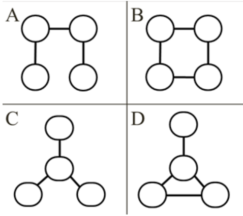
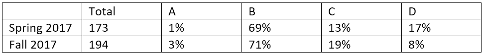
When I ran the study in the Spring of 2017, 69% of participants chose network B, 17% chose network D, and 13% chose network C. When I asked participants why they chose their network, it became clear that participants read network D as containing hierarchy. About half of the participants that chose this structure wanted to be the member at the ‘top’ of the picture. This was notable in part because in other work we’ve identified this structure as the worst performer (of these 4) and the person in that position as having the worse sense of identification with the team.
Seeing this, I repeated the experiment using a different set of network pictures, but otherwise identical.

These two sets of images present the same networks. All the relationships are the same between the members. The presentation of A and B are also literally identical with C and D being a little re-oriented but otherwise presenting the same network. Around the same percentage of participants chose B as their network of choice (71%), 19% chose C, and only 8% chose D. Within D, only 20% of participants chose the member that had previously been the ‘top’ of the network with this presentation. So, clearly, the presentation of these networks in Spring 17 drove some participants to misunderstand D and, when the presentation of the networks were changed to remove the implied hierarchy, D was chosen less often.
When I originally conducted the Spring 17 study and saw that a misunderstanding drove some participant choices, I was originally annoyed with myself. But, when I looked in the literature, there’s not a whole lot out there on how people perceive network pictures and their meaning. So, future research?